Make Ads Not Feel Like Ads: Three Tiers of UGC Naturalness That Determine Click‑Through Rate

Open TikTok or Facebook feed, and users make a judgment within 0.5 seconds: Is this an ad, or a friend’s daily post? This judgment directly determines CTR. This article breaks down three actionable approaches to “UGC feel” – from pixel‑level surface realism, to structural native disguise, to deep operations at the asset‑library level. Core argument: ad nativeness isn’t a style; it’s a ladder from “looks like an ad” to “doesn’t look like an ad”.
The attention window in a feed is extremely short; on average users decide to skip an ad after about 0.5 seconds. This means any material that requires users to “watch a few more seconds to understand” is already at a disadvantage from the start. UGC feel isn’t about lowering image quality, but about avoiding the user’s psychological defenses against commercial content at first glance.
The Nativeness Dividend: Why “Too Ad‑Like” Kills CTR
In feed environments, users’ defensive mechanisms against ads are trained over time. After Meta and TikTok’s algorithms pushed massive amounts of commercial content, users learned to spot visual ad patterns: high‑saturation product close‑ups, smooth camera movements, perfect lighting, tight editing rhythm. Once these features appear, users subconsciously switch to “ad mode”, and skip rates soar.
Native ads’ nativeness can be judged on three dimensions: visual, narrative, intent. “Visual” refers to the sense of realism, “narrative” to whether the content feels like a complete life segment, and “intent” to whether the user can instantly perceive that “this content is trying to sell something”. Among them, intent exposure is the most lethal – if users sense a sales intent, the other two dimensions won’t save the ad from being skipped.
The core strategy of UGC feel is to lower the “ad index” across all three dimensions simultaneously. The concept of “authentic creative” has been popular in overseas e‑commerce circles for a long time; essentially, it disguises ads as user‑generated content, letting the material compete for attention with friends’ daily updates in the feed. The three‑tier logic follows from this: the first tier solves visual issues, the second tier solves narrative issues, the third tier solves post‑scale maintenance.
Tier 1: Surface Realism – Pixel‑Level Recreation of “Hand‑Held” Visual Features
The first signal users use to identify an ad is often not the content but the image quality. Over‑sharp images, overly stable composition, perfect lighting – when all three are present, it’s basically an ad visual fingerprint. Conversely, the visual fingerprint of a UGC video includes slight handheld shake, noise in low‑light environments, retained ambient sound, and asymmetric framing.
In practice, teams can deliberately keep 1–2 minor focus errors or frame jitters. This subtle detail greatly reduces the algorithm’s probability of flagging the material as “commercial content”, while making users feel it’s a casual handheld shot.
Shooting parameters: vertical orientation is mandatory; you don’t need 4K – 1080p or even 720p is closer to native phone capture. Post‑production should be restrained: avoid high‑contrast filters, keep some color shifts and slight over‑exposure. Don’t erase all ambient sound; street traffic, indoor AC hum, these “unc” noises actually enhance realism.
The limitation of this tier is obvious: it only solves “looks like”, not “feels like”. Users may not recognize it as an ad at first glance, but halfway through they might notice the overly tidy structure or tight rhythm and realize it’s commercial. Tier 1 is suitable for teams just starting with UGC ads, as a low‑threshold entry solution.
Tier 2: Structural Re‑assembly – Disperse Selling Points and Hide Them Within a “Daily” Scene
Hard‑sell ads follow a linear hook‑point‑CTA structure, which is over‑exposed in feeds. Users have developed a conditioned reflex to the “first‑3‑seconds hook, middle product point, ending CTA” pattern, and the structure itself triggers psychological defense. Tier 2 flips this: narrative first, selling point later – start with a complete daily scene, letting product information naturally surface within it.
A native structure pushes the appearance of product points to after 60 % of the video’s total length, which significantly improves retention. This means the first 60 % must be sustained by the scene itself, not by product info. A typical approach is the “problem‑solution” structure: show a daily pain point, then let the product appear as the solution.

“Split‑screen comparison” is another native structure: left screen shows the before state, right screen the after state, with no narration needed – the visuals speak for themselves. This mimics users’ own comparison videos rather than ad presentation. Conversational scripts and spoken rhythm are also crucial – written‑style copy instantly reveals ad identity, while speech with pauses, repetitions, and filler words feels like genuine sharing.
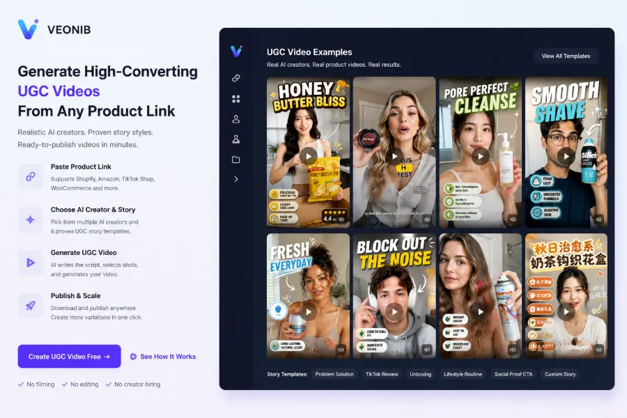
The cost of this tier is a noticeable increase in production and script‑writing difficulty. Teams must design different scenario stories for each product instead of reusing a single template. For teams with some UGC ad experience, tools like VEONIB can convert product links directly into scripts and storyboards with story templates, saving the time of building scenes from scratch. More complex product categories can look at this B2B hardware case study, which maintains realism while handling product showcase challenges.
| Comparison Dimension | Surface‑Realism Version | Structural Re‑assembly Version | Deep‑Native Version |
|---|---|---|---|
| Production Cost | Low | Medium | High |
| CTR Improvement | Limited | Noticeable | Sustained |
| Script Difficulty | Low | Medium‑High | High |
| Suitable For | Entry‑level teams | Experienced teams | Large‑scale teams |
Tier 3: Asset Library – When “UGC Feel” Is Mass‑Produced, How to Keep Nativeness
The biggest bottleneck for UGC feel assets isn’t production but creative fatigue after the inventory runs out. A single asset’s CTR drops noticeably after 2–4 weeks of continuous delivery due to fatigue. More troublesome is the fingerprint issue – platform algorithms detect homogeneous assets and throttle them; repeatedly using the same template will eventually be flagged.
I’ve seen a team fall into this trap. In their first round they over‑relied on a single AI UGC template; the platform’s algorithm recognized the fingerprint and throttled it, causing the account’s CTR to plummet within two weeks. By day 10 CTR dipped, by day 14 throttling was confirmed, and they had to take down all assets and rebuild the inventory. This lesson shows that UGC feel asset operations differ from traditional ads – they need continuous freshness to maintain the “not‑ad” illusion.
The countermeasure is to build a multi‑version asset library: prepare 5–10 stylistically different versions for the same product, mix them in delivery, and refresh templates regularly. Mass‑generating stylistically varied native‑feel assets is routine for large teams; planning for multi‑platform deployment of generated assets is also required. Ethical and platform‑review boundaries for AI‑generated content are another unavoidable issue – some platforms require disclosure of AI‑generated material, so compliance risk must be considered in library management.
Real user quality ratings can be seen on G2; these feedbacks help gauge asset direction. Long‑term operational rhythm for UGC feel assets is recommended: add at least 20 % new assets each week, retire the lowest‑performing batch every 3–4 weeks, and keep the inventory fluid. This tier is a must‑solve for large‑scale teams; the depth of the asset library directly determines campaign lifespan.
FAQ
Why does “too ad‑like” significantly lower UGC video CTR?
Because users have a conditioned reflex to skip ads. Within the average 0.5 second judgment window in feeds, any “ad feature” in visual, rhythm, or narrative structure triggers skipping. The core of UGC feel is to lower the visibility of these features.
Does UGC feel mean the lower the image quality, the better?
No. UGC feel is about “removing ad embellishments”, not deliberately making things look old. Image quality can retain the natural look of phone capture, but content structure and narrative rhythm are the decisive factors. Many high‑quality assets are skipped because their rhythm feels like an ad.
Will AI‑generated UGC videos be flagged as ads and throttled by platforms?
Possibly. Platform algorithms detect homogeneous asset fingerprints; repeated use of the same template leads to throttling. Countermeasures include building multi‑version libraries, mixing styles, refreshing templates regularly, and staying aware of each platform’s AI‑content disclosure requirements.
Which tier is suitable for which teams and budgets?
Tier 1 suits teams just starting with UGC ads – lowest cost, only requires changes in shooting and post‑production habits. Tier 2 fits experienced teams – needs investment in script design. Tier 3 is for large‑scale deployment – requires an asset‑library operation system.
How can I quickly test which nativeness tier my asset belongs to?
Play the asset with sound muted and see if you can tell it’s an ad within the first 3 seconds. If you can still sense commercial intent without sound, the structural layer needs work. Then compare it with high‑engagement UGC videos of the same category, checking rhythm and narrative structure gaps.
Share Article