The Notch Is a Supply Chain Problem in Disguise
Cross-border operators spend their days inside dashboards: Seller Central, Shopify admin, TikTok Shop seller center, a freight forwarder’s portal, a 3PL’s WMS, a payment provider’s reconciliation screen. Every one of those is a browser tab, and every tab is a context switch. So when I see a Mac utility that argues the dead space at the top of your screen should be a control surface rather than a black cutout, I don’t file it under “desktop toys.” I file it under attention economics. iLand, launched by maker Taha Çiftçi under codemlabs, is a notch-resident widget layer for macOS. It is not an e-commerce tool. But the design logic behind it — collapse frequently used actions into the space you’re already staring at — is exactly the logic that separates operators who scale from operators who drown.
What iLand Actually Does, Stripped of Launch-Day Enthusiasm
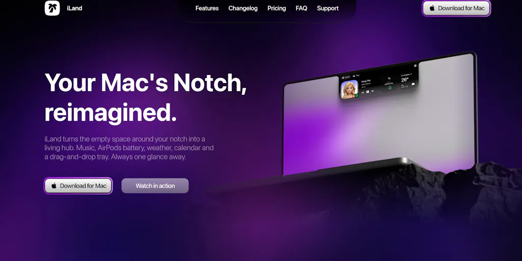
The pitch, in the maker’s own framing, is that your Mac’s notch “takes up space on your screen every day” and iLand turns it into “a place to control your music, move files around, and reach the small tools you use throughout the day.” Concretely, the launch describes five capability clusters:
- Playback and volume control via gestures
- A file drop tray for temporarily parking assets
- File conversion, screenshots, and screen recording
- Calendar, weather, and timer widgets
- A color picker, translator, and app launcher
- Customizable widgets, appearance, and animations
That’s the whole surface area. No API, no integrations with business systems, no mention of pricing, and no stated platform requirements beyond macOS — the maker does not disclose which Mac models or OS versions are supported, and a commenter asking whether it works on Macs without a notch went unanswered at the time of the scrape. That last gap matters more than it looks, and I’ll come back to it.
The real product is the gesture layer, not the widgets
Read the bullet list again and notice which items are commodities and which aren’t. Calendar, weather, timer, color picker, translator — every one of those exists as a free menu bar app, a Raycast extension, or a Chrome tab. Nobody switches tools for a weather widget. The differentiated claim is the first bullet: control playback and adjust volume with gestures. Gesture-driven control of a persistent screen region is the only thing here that requires real engineering, and it’s the only thing that could plausibly change muscle memory. If iLand’s gestures are tight, the widget list is decoration. If the gestures are laggy or ambiguous, no amount of widget variety saves it.
That’s the same trap e-commerce SaaS falls into constantly. A tool launches with a 40-feature grid, and the only feature that ever gets used is the one that removes a repeated physical action. Think about how Helium 10 actually gets used by a working Amazon seller: not the full suite, but one or two modules — usually keyword tracking or the listing analyzer — opened twenty times a day. Everything else is shelf-ware that justifies the subscription tier.
How This Compares to What Already Owns That Screen Real Estate
The honest competitive frame for iLand isn’t other notch apps. It’s the incumbent layer that already sits at the top of a Mac: the menu bar, and the launcher that has colonized it.
Raycast is the obvious comparison and the one I’d make if I were advising the maker. Raycast owns “press a hotkey, get anything” on macOS, has a deep extension ecosystem, and has been steadily absorbing exactly the utilities iLand lists — clipboard history, window management, file search, snippets, quick calculations. Alfred occupies the same territory for the old guard. Bartender owns menu bar organization. NotchNook and Boring Notch have already staked out the notch specifically, with the latter free and open source.
So the question a buyer should ask is not “is this useful?” It’s “what does this do that my existing launcher doesn’t?” The maker’s answer is spatial: Raycast is summoned, iLand is ambient. You don’t invoke it; it’s already there, occupying pixels you’ve already paid for and currently get nothing from. That’s a legitimate distinction. Whether it’s a valuable distinction depends entirely on whether you’re the kind of person who keeps a hand on the trackpad and a file in flight, or the kind who lives in keyboard shortcuts.
Why Amazon sellers should care more than Shopify ones
Here’s where I’ll make a judgment call that has nothing to do with the product’s feature list.
If you run a Shopify DTC brand, your working day is fairly consolidated: one admin, one Klaviyo account, one ad manager, one analytics tab. Your context-switching tax is real but bounded.
If you run Amazon FBA, your day is structurally fragmented. You’re in Amazon Seller Central for inventory and cases, a separate ads console for Amazon Advertising, a reimbursement or audit tool, a repricer, a review-monitoring service, a freight forwarder’s tracking portal, and — if you’re cross-border — at least one Chinese-language supplier communication channel. Add TikTok Shop or Temu or SHEIN seller centers on top and you’re cycling through nine or ten surfaces before lunch.
A tool that parks a file, starts a timer, converts a spec sheet, and grabs a screenshot without leaving the current window is worth more to that operator than to a single-channel DTC founder. Not because the features are better, but because the fragmentation is worse. This is the same reason Etsy sellers with 200 SKUs care disproportionately about bulk-edit tools while a 5-SKU brand doesn’t. Pain scales with surface count.
The math on switching costs
Let me be concrete about the arithmetic, because “saves time” is the most abused phrase in tooling reviews.
Suppose iLand’s gesture layer and drop tray save you four seconds per context switch, and you switch contexts sixty times a day. That’s 240 seconds — four minutes. Over 250 working days, roughly 16.7 hours. At a fully loaded operator cost of, say, $40/hour, that’s about $670 a year. If iLand were priced at typical indie Mac utility levels — and the launch page does not disclose pricing, so I’m reasoning about a band, not a fact — the payback would be trivially positive.
But the four-second assumption is doing all the work, and it’s probably optimistic. A gesture that misfires, a tray that doesn’t accept the file type you dropped, a widget you have to reconfigure because an OS update moved it — each of those eats the savings. The real question isn’t the theoretical time saved. It’s the variance. A tool that saves four seconds 80% of the time and costs fifteen seconds 20% of the time is roughly break-even and psychologically worse than doing nothing.
What Cross-Border Operators Should Actually Steal From This
I don’t expect most readers of this blog to install a notch widget. I do expect them to recognize the pattern, because it’s the same pattern that should govern how you build your internal ops stack.
Ambient beats summoned
The strongest idea in iLand is that the tool lives where your eyes already are, rather than requiring you to remember it exists. Most seller-side tooling does the opposite: it’s a dashboard you have to go to. That’s why so many internal reports die. Someone builds a beautiful weekly P&L in Google Sheets, shares the link, and within three weeks nobody opens it.
The fix isn’t more dashboards. It’s pushing the two or three numbers that actually trigger action into surfaces people already touch daily — a Slack channel, an email digest, a pinned browser tab, a phone widget. If your Amazon inventory cover alert only exists inside a BI tool nobody logs into, you don’t have an alert. You have a document.
One repeated action is worth more than ten features
Apply the iLand filter to every tool in your stack this quarter. For each subscription, name the single repeated physical action it removes. If you can’t name one, you’re paying for a feature grid, not a workflow.
This is brutal when you actually do it. A review automation tool might justify itself entirely on “one click to request reviews in bulk” while its analytics dashboard goes unopened. A repricer might justify itself on “never manually adjust a Buy Box price again” while its reporting layer is dead weight. A returns management platform might justify itself on “customer self-serve instead of an email thread” while everything else is noise.
The corollary: when you evaluate new tools, ask the vendor to demo the one repeated action, not the tour. Vendors hate this. Buyers should insist on it.
Consolidation is a strategy, not a preference
The reason notch utilities exist at all is that macOS users got tired of ten menu bar icons. Cross-border sellers are living through the same consolidation pressure on a much bigger scale. The last three years of e-commerce SaaS have been a land grab of point solutions — one tool for UGC, one for attribution, one for landed cost, one for compliance, one for returns. The next three years will be about which of those get absorbed into platforms.
For an operator, the practical implication is portfolio hygiene. Every point solution you add is a login, a data sync that will eventually break, a renewal you’ll forget, and a vendor that might get acquired or shut down. Before you add the eleventh tool, check whether tool number four already has the feature buried in a tier you’re not using. I’ve watched sellers pay for Klaviyo and a separate SMS platform and a separate review tool when two of the three were already bundled into tiers they’d already bought.
Where the math breaks
Two honest caveats on the consolidation argument.
First, bundled features are usually worse than the point solution. The review widget inside your email platform is rarely as good as the dedicated review platform. Consolidation saves money and attention but costs capability. The right call depends on whether the feature is core to your differentiation or merely table stakes. Review collection is table stakes; if the bundled version gets you to 4.4 stars, take it. Attribution modeling is not table stakes; if you’re spending seven figures on paid social, pay for the specialist.
Second, consolidation creates vendor risk concentration. If one platform holds your email, SMS, reviews, and helpdesk, a single outage or a single pricing change hits everything at once. I’ve seen this play out with Shopify app stacks where a single app deprecation cascaded into three broken workflows. Diversify the critical path, consolidate the periphery.
Where My Judgment Says iLand Falls Short
I’ll be direct, because the launch page gives me enough to be direct.
The unanswered question is disqualifying for a large chunk of the audience. A commenter asked whether iLand works on Macs without a notch, noting they have an older MacBook and wondering whether it “just sits at the top of the screen.” That question received no reply in the scraped thread. For a utility whose entire premise is a hardware feature, “does this work on my machine” is not a nice-to-have FAQ — it’s the first thing a buyer needs. Every MacBook Air sold before the M2, every external monitor, every clamshell setup with a docked laptop, and every Mac mini user is potentially excluded. That’s a large share of the professional Mac installed base, and it’s a share disproportionately populated by people who run businesses from a desk. Not answering it on launch day is a self-inflicted wound.
No pricing disclosed. The launch page says nothing about cost, free tier, or licensing model. For a utility competing against a free, open-source notch app and against launchers that already bundle these features, pricing opacity is a conversion killer. Operators evaluating tools for a team of five need to know whether this is a $9 one-time purchase or a $6/month seat. Those are different decisions.
No mention of integrations. Everything iLand does is local and generic. Nothing connects to a business system. That’s fine as a consumer utility, but it caps the ceiling. If the maker wanted the operator audience, the obvious moves would be a clipboard-and-screenshot pipeline that lands in a shared drive, or a timer that logs to a timesheet, or a drop tray that pushes to a Google Drive folder. None of that is promised.
The widget list is undifferentiated. Calendar, weather, timer, translator, color picker, app launcher. I can get every one of those from a launcher I already have, or from free menu bar apps, or from the OS itself. The gesture control is the product. The rest is padding the feature count for the launch page.
Customization is a double-edged promise. “Customize the widgets, appearance, and animations” reads as a benefit, but in practice, deep customization is where utilities go to die. Every configuration option is a surface that can break across OS updates, and a notch overlay that misbehaves after a macOS point release is worse than no overlay at all. I’d want to see how the maker handles OS-update churn before recommending this to anyone whose machine is their revenue engine.
The audience mismatch nobody on the launch page mentioned
Here’s the thing that struck me reading the thread: the two comments are from people reacting to the idea — “the notch always felt like wasted space,” “keeping small stuff close instead of opening five apps is a good idea” — not to any demonstrated workflow. That’s typical of Product Hunt, and it’s a leading indicator of a specific failure mode. Ideas that everyone agrees are good but nobody can describe a daily use for tend to get upvoted and not retained.
The maker closed with a genuinely good question: “What would you want one gesture away in your Mac’s notch?” That’s the right question. But the answer for a cross-border seller is not music control or weather. It’s “the tracking number for the order the customer just emailed about” and “the landed cost of this SKU” and “the last message from my supplier.” Those are the things that should be one gesture away. iLand doesn’t do any of them, and it’s not trying to. Which is fine — but it means the operator audience should admire the design pattern and wait for someone to apply it to their actual workflow.
What I’d Watch / Test Next
Concrete moves for this week, in priority order.
If you’re evaluating iLand for yourself: before installing anything, run a two-day context-switch audit. Keep a scratch note and tally every time you leave the window you’re working in to grab a file, check a number, or convert something. If that tally is under twenty a day, a notch utility won’t move your needle and you can skip this category entirely. If it’s over fifty, the ambient-control thesis has a real shot and iLand is worth a test — but only after you confirm it supports your hardware, which the launch page does not currently tell you.
If you’re auditing your tool stack: for each subscription over $50/month, write down the single repeated physical action it removes. Anything where you can’t complete that sentence in one line goes on a 30-day cancellation watchlist. Expect to find two or three. That’s your budget for the next tool you actually need.
If you’re a tool builder reading this: the lesson from iLand’s launch isn’t the widget list. It’s that the maker found an underused surface — pixels everyone owns and nobody uses — and asked what belongs there. Cross-border has its own version of that surface. It’s the order confirmation email nobody customizes, the packing slip nobody brands, the post-purchase SMS nobody sends, the supplier PO template nobody standardizes. Those are notches. They’re already in the flow, already paid for, and currently producing nothing. Find one, own it, and make it one gesture away.