Why a Climate Data iPhone App Should Be on Every Cross-Border Seller’s Radar
If you manage inventory across Amazon, Shopify, or TikTok Shop, you already know that the single biggest variable you can’t control is the weather — not just local weather for demand spikes, but global climate patterns that ripple through commodity prices, shipping lanes, and manufacturing output. El Niño is a recurring warming pattern in the tropical Pacific that has been linked to droughts in Southeast Asia, floods in South America, and anomalous winter demand in North America. Yet most sellers rely on lagging indicators: cocoa futures spiking, port congestion in Panama, or a sudden surge in raincoat orders. The problem is that by the time those signals hit your dashboard, your margin is already gone. That’s why the El Niño iPhone app — built by maker Tony Expert — deserves a serious look, not because it forecasts weather, but because it turns messy NOAA data into a visual, digestible signal for anyone whose supply chain depends on the tropical Pacific.
What El Niño Actually Solves for Operators
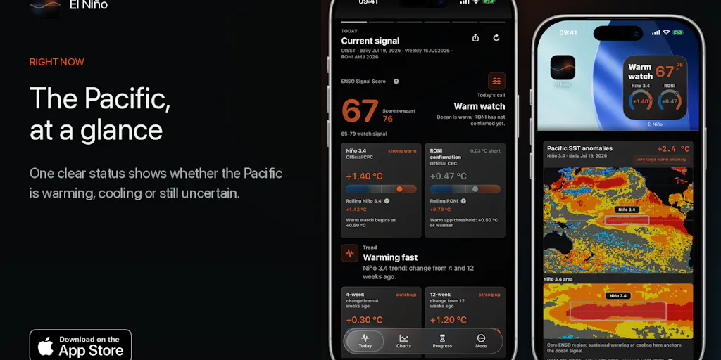
The app doesn’t pretend to be a forecast tool. Instead, it answers four plain questions: what the Pacific is doing now, how strong the signal is, what changed recently, and what still needs to happen before the status changes. For a cross-border seller, this is the difference between knowing “there’s a chance of El Niño” and understanding “the current evidence is at a 78 out of 100 — and here’s when similar conditions tipped into disruption in 2015.” The maker’s launch comment explicitly frames the app for agriculture, energy, commodities, and insurance — industries that have long used climate intelligence for procurement and risk. E-commerce operators are essentially in the same business: buying inventory months ahead, hedging currency and freight, and timing promotions based on demand patterns. El Niño’s 0–100 score shows how strong the evidence is, not a probability — which is more useful than a vague “alert” that gives false confidence. The app’s historical comparisons show how similar completed events developed, providing context you can’t get from a Helium 10 demand snapshot or a Klaviyo weather-triggered flow.
The real unlock is that this data is publicly available from NOAA but buried in raw datasets. Even experienced supply chain managers don’t have time to cross-reference SST (sea surface temperature) anomalies against trade wind data and historical analogs. El Niño does that in one screen. For an Amazon Seller Central account manager who ships via the Panama Canal or sources textile raw materials from Peru, that clarity can shift inventory buy decisions weeks earlier than waiting for commodity indices to move.
How It Differs from Existing Options
Most weather-driven tools for e-commerce are either too granular (local weather APIs for demand prediction) or too macro (seasonal outlooks from the Climate Prediction Center). El Niño sits in a neglected middle: it tracks a specific global-scale pattern that has outsized impact on supply chains. Compare it to a service like WeatherSource which offers hyperlocal commercial forecasts but costs thousands per month — El Niño is a one-time upfront payment with no subscription. That alone makes it accessible for a solo DTC operator or a small brand team that can’t justify a specialized weather intelligence budget.
Another difference is the UI. The app is designed for non-experts. The first screen gives a clear status — warming, cooling, or still uncertain — with a map showing where the unusual warmth or coolness sits. That’s a radical improvement over reading NOAA’s technical discussion briefs or staring at a spreadsheet of ONI (Oceanic Niño Index) values. The visual Brief feature turns the current status into a square or portrait image ready for feeds and chats — useful for internal Slack updates or supplier communication without jargon. No existing commodity data tool I’ve seen (think Barchart or TradingEconomics) provides that kind of shareable, annotated snapshot.
The app also refreshes directly from public NOAA sources, which means you’re not dependent on a third-party data vendor that might be delayed or monetized. That independence is a sharp contrast to the “black box” models used by logistics providers like Flexport that keep their climate risk algorithms proprietary. For an operator who wants to validate a carrier’s surcharge or a procurement team’s rush order, having a free-to-access signal is invaluable.
Why Amazon Sellers Should Care More Than Shopify Ones
Amazon’s supply chain is uniquely exposed to El Niño on two fronts: inventory lead times and commodity input costs. FBA sellers who use the Panama Canal for inbound shipments from Asia face direct delays when low water levels restrict vessel draft — a documented El Niño consequence. Meanwhile, Amazon’s private-label brands in categories like apparel, electronics, and home goods are sensitive to raw material price swings driven by climate shocks (e.g., cotton from India, lithium from Chile, wood pulp from Brazil). A Shopify DTC seller who manufactures domestically and uses ShipStation for fast last-mile might see less direct impact, but even then, any volatility in packaging materials (paperboard) or shipping fuel passes through. The difference is that Amazon sellers operate on thinner margins and longer holding periods — the cost of being wrong about a climate signal compounds across minimum order quantities, storage fees, and holiday inventory prep. For them, a 78-out-of-100 alert from El Niño might justify ordering 10% less from a supplier in a region prone to drought-related crop failure, months before the news hits mainstream media.
What Cross-Border Sellers Can Borrow
The app’s architecture offers a blueprint for how to operationalize a messy data stream into decision-making. The four-question framework (“What is happening now? How strong? What changed? What still needs to happen?”) could be replicated for other signals e-commerce operators care about: port congestion indices, tariff change trackers, exchange rate volatility monitors. Most sellers I know subscribe to multiple data feeds (e.g., Freightos Baltic Index, Shoppable Business API, TradeData.net) but lack a simple dashboard that synthesizes them into an actionable status. El Niño proves it’s possible to build a consumer-grade interface around complex science without dumbing it down.
The historical comparison feature is another directly transferable idea. Instead of comparing climate patterns, imagine an app that shows how similar tariff hikes or port strikes unfolded in the past, with visual timelines. That’s the kind of pattern recognition that a senior account manager does intuitively, but a tool could systematize. The widget and local alert features (sending notifications when the signal changes meaningfully) are also exactly what an operations team needs — not a daily email, but a push when the evidence crosses a threshold.
Where the Math Breaks
Still, El Niño has limitations that matter for practical use. First, it’s iPhone-only. No Android, no web app, no API. For a cross-border team that lives in spreadsheets and Slack, that means the intelligence stays in one person’s pocket instead of being integrated into a Salesforce order flow or a QuickBooks budget forecast. Second, the app provides context but not a forecast — the maker explicitly states it is not official NOAA guidance or a warning service. That’s appropriate, but sellers need probabilistic guidance to make commit-or-wait decisions. A 0–100 evidence score is helpful, but without a probability of transition to El Niño conditions in the next 30 days, it’s still an input you have to interpret yourself.
Third, the app’s data is limited to the tropical Pacific. While El Niño is the most consequential climate pattern for global trade, it’s not the only one. The Indian Ocean Dipole, the Arctic Oscillation, and the Madden-Julian Oscillation all affect manufacturing and shipping in different regions. A seller sourcing from Vietnam or Thailand may need the IOD signal more than the ENSO signal. Finally, the app has no integration with logistics platforms like ShipBob or Flexport. Until a climate data source feeds directly into your inventory planning software, it remains a manual check — valuable, but not automated.
What I’d Watch / Test Next
Here’s what I would do this week if I ran a cross-border operation exposed to Latin America or Southeast Asian supply chains. First, download the El Niño app and set up local alerts for any shift above 60 on the evidence scale. Watch the widget daily. Second, for the next 30 days, keep a simple log comparing the app’s status screen against your own sourcing delays, commodity price moves, or order cancellations. See if the signal leads real-world disruptions by two to four weeks — if so, you’ve found an early warning system. Third, evaluate building a similar “vital signs” dashboard for your own operation: pick three key external signals (e.g., Panama Canal transit times, Chinese yuan exchange rate, shipping container availability index) and design a single-screen status view for your team. That’s the real innovation here — not the app itself, but the framing of a complex data stream into four simple questions. If El Niño proves useful for inventory timing, I’d also pressure the maker to add a web widget or a simple JSON feed (maybe via a paid tier) so the data can plug into Tableau or a Google Sheet. Until then, treat it as a canary — and a reminder that the weather doesn’t care about your Amazon premium account.