The Cursor Is the New Onboarding Funnel
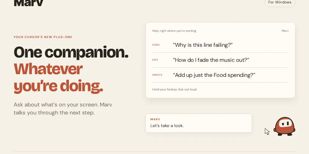
Every cross-border operator I know is running the same quiet experiment right now: how many SaaS tabs can one VA juggle before the wheels come off? A typical Amazon brand owner in Shenzhen or a Shopify DTC team in Austin is staring at Seller Central, Helium 10, Klaviyo, a 3PL portal, a returns dashboard, and a payment reconciliation sheet — often in the same afternoon, often in a second language. The bottleneck stopped being data access years ago. It’s now interface fluency: knowing which toggle, which buried export button, which settings pane does the thing. That’s why a small Windows companion called Marv, built by Cameron McHardy, caught my attention. It doesn’t promise to run your store. It promises to sit next to your cursor, watch what’s on your screen, and point at the button while explaining it out loud. For anyone managing software they didn’t grow up on, that’s a bigger deal than it sounds.
The Problem Marv Actually Solves (And Why It’s Not a Chatbot)
McHardy’s framing on the launch page is almost painfully relatable: “you’re looking at an app, you know what you want to do, but you have no idea which button or setting gets you there.” That’s not a knowledge gap. It’s a translation gap — between intent and interface. And it’s the exact gap that eats hours out of a cross-border operator’s week when you’re onboarding a new VA in Manila, training a fulfillment coordinator in Poland, or trying to figure out where Temu’s Seller Center hides the bulk-edit for shipping templates.
What makes Marv structurally different from the wall of AI assistants we’ve been drowning in is the output modality. A chat window returns text. Marv returns spatial annotation: it can “circle things, point at buttons and draw over the screen while it explains.” One commenter, Gal Dayan, nailed the distinction: “most AI help ends up describing where to click in words, and words are a bad medium for pointing at a specific pixel.” That’s the whole thesis. When you’re staring at Seller Central’s Advertising Console and someone tells you to “click the campaign settings dropdown,” you still have to find it. When something draws a ring around it, you’re done.
Why Amazon sellers should care more than Shopify ones
I’ll say the quiet part out loud: Shopify’s admin is one of the best-designed surfaces in e-commerce. A new hire can figure out order fulfillment in an afternoon. Amazon Seller Central is the opposite — an accreted pile of regional variants, legacy menus, and hidden settings that differ between US, EU, JP, and every marketplace in between. Add Helium 10, Jungle Scout, or Sellerboard on top and you’ve got a UI that punishes anyone who didn’t learn it in 2019.
That asymmetry matters. A tool like Marv has near-zero marginal value for a Shopify merchant who already knows their way around. It has enormous value for an Amazon brand owner juggling five marketplaces, or a Temu seller trying to reverse-engineer a platform that redesigns its seller backend every quarter. The worse the UI, the higher the ROI on a cursor-side copilot.
The multi-monitor detail that actually matters
Dayan asked the sharpest technical question in the thread: does the overlay get confused across multiple monitors? McHardy’s answer is the kind of design decision that separates a shippable tool from a demo: “The annotations stay with the app or page you asked about too. If you switch away, they don’t carry over onto whatever you open next. Come back and they’re still there where you left them.”
For anyone running a trading desk setup — spreadsheets on one screen, Seller Central on another, Slack on a third — that per-window scoping is the difference between a tool you trust and a tool that makes you second-guess what you’re looking at. Global overlays are a nightmare. Per-app annotations are the right default.
How It Compares to the Incumbents You’re Already Paying For
Let me be blunt about the competitive set, because the launch page doesn’t do this work for you.
Versus generic AI assistants. ChatGPT, Claude, and Gemini all handle “how do I do X in Seller Central” reasonably well in text. But they’re blind to your actual screen. You describe the problem, they describe the solution, and you’re back to hunting. Marv closes that loop by grounding the answer in what’s literally rendered in front of you.
Versus screen-recording tools like Loom or Scribe. These are what most cross-border teams actually use today for SOPs — record a walkthrough, annotate the steps, drop it in Notion. Great for documenting a workflow once. Useless for the moment-to-moment “what does this button do” question. Marv is closer to a live Loom that answers back.
Versus in-app onboarding tools like Pendo or Appcues. Those live inside the vendor’s product and only help with that vendor’s product. Marv is platform-agnostic — it works on whatever’s on your screen, which is the only way to help someone who touches eight different dashboards a day.
Versus RPA and browser automation. Tools like Zapier, Make, or browser extensions that script Seller Central actions are powerful but brittle, and they assume you already know the workflow well enough to automate it. Marv sits upstream of automation: it’s for the discovery phase, not the execution phase.
The honest read: Marv isn’t competing with any single one of these. It’s occupying a slot — ambient, visual, screen-aware help — that none of them fill cleanly.
What Cross-Border Operators Can Borrow From This
Even if you never install Marv, the design principles behind it are worth stealing for your own internal tooling and SOPs.
1. Stop writing SOPs as text. Annotate them.
If your VA onboarding doc says “go to Orders > Manage Returns > filter by status,” you’ve written a treasure map with no X. Screenshot the actual screen, draw the circle, and link it. The comment thread makes this visceral: David Turner complained about “reading three forum threads just to find one setting,” and Chen Ben-Ari described the exact failure mode — “I can’t find the button the LLM is referring to, waste a lot of time looking for it, and eventually just let it control my screen, which burns even more time and tokens.” Every minute your team spends translating text into pixels is a minute not spent on margin.
2. Treat interface fluency as a hiring and training metric.
The operators winning right now aren’t the ones with the best data — they’re the ones whose teams can move inside their tools. If you’re scaling across markets, budget for screen-aware training, not just documentation. A 90-second annotated walkthrough beats a 2,000-word wiki page every single time.
3. Watch the hedging problem before you trust it with money.
The most important comment in the entire thread comes from Asad M.: “If a chat reply is wrong I argue with it, but a circle around a button reads as certainty and I’ll have clicked before I’ve thought about it. The feature I’d want is Marv visibly hedging when it’s guessing, because confidently pointing at the wrong control is the failure that actually costs someone their afternoon.”
That’s not a nitpick. In a cross-border context, a confidently-wrong annotation on a pricing rule, a shipping template, or an ad campaign budget field isn’t an afternoon lost — it’s a week of bad data, a marketplace policy violation, or a refund wave. McHardy’s response was refreshingly honest: “sometimes the right response is to ask you to clarify rather than draw anything.” That instinct needs to be a shipped feature, not a nice-to-have.
4. Pre-launch waitlists are a legitimate go-to-market for tooling.
One commenter, Luca Ardito, flagged the strategy directly: “launching before actually releasing the product makes a lot of sense.” For anyone building internal tools or evaluating vendor roadmaps, this is worth noting. Marv is collecting early-access signups at meetmarv.org — no pricing disclosed, no ship date disclosed, no platform roadmap beyond Windows. That’s a signal, not a red flag, but it’s a signal you should read clearly.
Where My Judgment Says This Falls Short
I want to like Marv. I do like the idea of Marv. But there are three places where I’d push back hard before recommending it to an operator running real money.
First: Windows-only. McHardy is explicit — “I’ve been building Marv for Windows.” That’s roughly half the cross-border operator base, and arguably the smaller half when you consider that most DTC and Amazon brand teams I know are running Macs for design, ops, and finance. If you’re a Shopify merchant on a MacBook, this isn’t for you yet. Not disclosed is whether macOS or Linux are on the roadmap.
Second: the trust surface is enormous. A tool that watches your screen and draws on it is, functionally, a screen-recording tool with write access to your display. For a seller handling PII, payment data, and marketplace credentials, the security posture matters more than the UX. The launch page doesn’t address data handling, retention, or whether screen content is processed locally or in the cloud. I’d want answers before letting it near Seller Central.
Third: the “companion character” framing is a double-edged sword. McHardy says he “put a lot into the character” and wanted Marv to “feel like a little companion you’d actually want on your desktop.” That’s charming for a consumer product. For a B2B operator managing a team, it can read as unserious — and worse, it can encourage the exact over-trust that Asad M. warned about. A cute avatar confidently circling the wrong button is more dangerous than a sterile one, not less.
Where the math breaks
Let’s do the crude ROI. If Marv saves a VA 20 minutes a day at, say, $8/hour fully loaded, that’s roughly $27/month in recovered time. It’s a no-brainer if the pricing lands under that. But if it’s $30–50/month per seat and your team is 15 people, you’re now paying for a tool whose value depends entirely on how bad your existing UIs are. For a Shopify-only team, the math breaks immediately. For a five-marketplace Amazon team, it probably doesn’t. Segment accordingly.
What I’d Watch / Test Next
Here’s what I’d actually do this week if I were running a cross-border team and evaluating Marv — or anything like it.
Sign up for the waitlist at meetmarv.org and stress-test it on the ugliest UI you own. Not Shopify. Not a clean SaaS. Take it straight to Seller Central’s Advertising Console, Temu’s Seller Center, or your 3PL’s portal. If it can reliably point at the right control in those environments, it’s real. If it only works on well-labeled buttons, it’s a demo.
Run a hedging audit. Before you trust it with anything that touches money, deliberately ask it ambiguous questions — “where do I change my shipping cutoff” on a screen with three shipping-related panels — and watch whether it guesses or asks. McHardy has acknowledged this is a design priority. Your job is to verify it shipped.
Ask the security questions in writing. Data retention, local vs. cloud processing, whether screen captures are stored, and what happens if the tool sees a customer’s address or a payment confirmation. If the answers aren’t documented, don’t deploy it on a production workstation.
Borrow the pattern, not necessarily the product. Even if Marv isn’t ready, the underlying insight — that interface fluency is the real bottleneck in cross-border ops — is actionable today. Start annotating your SOPs with screenshots and arrows. Start measuring how long new hires take to find their first button. That metric will tell you more about your operational leverage than any dashboard.
The category is real. The question is whether this specific execution is the one that earns a seat on your desktop — and that’s a question only your ugliest UI can answer.