Why a Toy Task App Is Actually a Masterclass in Cross-Border Product Design
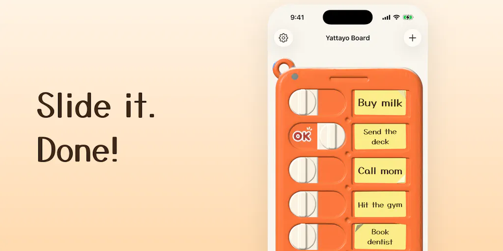
Every cross-border seller I know is chasing the same elusive dragon: product-market fit that doesn’t require a race to the bottom on price. We obsess over Helium 10 data, keyword gaps, and competitor review mining, but the real unlock is often something far more subtle—the emotional resonance of a physical interaction translated into a digital experience. When I saw UNCHIKUN and its companion app Yattayo launch on Product Hunt, I wasn’t interested in the task management category. I was interested in the principle: a solo developer rebuilt a mundane object—an orange plastic chore checklist—as a 3D interactive board, and the market responded. For Amazon FBA sellers drowning in SKU proliferation and Shopify store owners fighting for a single percentage point of conversion, this is a case study in differentiation through tactile UX. It proves that in a world of infinite digital sameness, feel is a feature. And that lesson applies whether you’re selling a $12 kitchen gadget or a $200 subscription software tool.
The Problem: Digital Fatigue and the Commoditization of Utility Apps
We live in an era where every productivity tool looks the same. Open your phone and you’ll find a graveyard of to-do list apps—all with the same sterile, flat design, the same swipe-to-delete gestures, and the same guilt-inducing notification badges. The market is saturated with offerings from giants like Todoist and Microsoft To Do, not to mention the native Apple Reminders app that ships free on every iPhone. The problem isn’t a lack of features; it’s a lack of emotional engagement. We check tasks off not because we feel accomplished, but because we want the red badge to disappear.
Ryo Tsuzukihashi, the maker behind Yattayo, identified this friction. He didn’t start with a feature list. He started with a photograph of a physical object—a plastic slider checklist you stick on the fridge. The tactile satisfaction of sliding a physical tab to “done” and hearing it click is a sensory reward that no digital checkbox can replicate. The core problem Yattayo solves isn’t task management; it’s interaction inertia. It’s the same reason why DTC brands spend thousands on premium unboxing experiences. The moment of interaction—whether it’s opening a box or completing a task—is a moment of truth. If that moment feels cheap, the entire product feels cheap. If it feels satisfying, the user forgives a multitude of sins.
For cross-border operators, this is a wake-up call. We spend so much time optimizing the logistics of the customer journey—shipping times, tracking pages, return policies—that we often neglect the psychology of it. A user doesn’t remember that your package arrived in 3 days; they remember the crunch of the kraft paper and the magnetic snap of the box lid. Yattayo is a digital manifestation of that physical psychology, and it works.
How Yattayo Differs from the Incumbents (And What You Can Steal)
The differentiation here is not subtle; it’s visceral. Where Things 3 relies on beautiful typography and a clean hierarchy, and TickTick relies on sheer feature density, Yattayo bets on physics. The UI is not a flat imitation; it’s a “real 3D object.” Every task is a slider you physically drag. It clicks like a ratchet on the way and thunks at the end. An “OK” stamp lands when it’s done. This is not just gamification; this is sensory substitution. It mimics the haptic feedback of a mechanical switch.
This approach has deep implications for how we build and market products. Consider the “unboxing” trend on TikTok Shop. The most viral products aren’t the most expensive; they are the ones with the most satisfying mechanical actions—the pop of a fidget slider, the ratchet of a torque wrench, the magnetic closure of a phone case. Yattayo validates that this “ASMR” quality can be applied to software UI.
Why Amazon Sellers Should Care More Than Shopify Ones
Shopify merchants often sell visual products—clothing, decor, jewelry—where the “feel” is implicit in the photos. Amazon sellers, on the other hand, often sell functional commodities—kitchen tools, organizers, electronics accessories. For us, the “feel” is the only differentiator against a sea of identical listings.
If you are an Amazon FBA seller looking at Yattayo, you should not be looking at the app itself. You should be looking at the mechanism. The app uses haptic feedback and 3D rendering to simulate a physical interaction. You can apply this same logic to your product photos and videos. Instead of a static image, show a video of the slider moving, the lid clicking, the gear turning. The “click” is the proof of quality. If a developer can make a to-do list feel like a physical object, you can make a plastic container feel like a premium vault.
The Tech Stack and the “Physical UI” Gamble
The maker explicitly asks whether the “physical-feeling UI” is “worth the effort, or just a gimmick.” For a solo developer, building a 3D object that syncs across iPhone, Apple Watch and Mac over iCloud is a significant technical lift. Most developers would have taken the shortcut—a flat CSS animation that mimics a slider. Ryo chose the hard path: a real 3D object with ratchet sounds and stamp effects.
This is a classic “cost of quality” decision. In manufacturing, you have a choice between a cheap plastic hinge and a metal one. The metal hinge costs more, but it changes the perceived value of the entire product. Yattayo is the metal hinge. The widget shows the real board, allowing you to slide a task done without opening the app. This is not a trivial feature; it’s the crux of the experience. It brings the physical interaction to the home screen, bypassing the friction of app-launching.
For cross-border sellers, this is a lesson in premium positioning. You can compete on price, or you can compete on feel. The “free for up to 3 tasks” pricing model is a deliberate hook. It allows users to experience the physical pleasure of the slider without commitment. This is the “freemium” model applied to sensory gratification. You give away the “click” for free, and then charge for the “thunk” of unlimited tasks. This is a more sophisticated version of the “sample” strategy used in food and beverage—give them a taste of the premium experience, and they will pay for the full bottle.
Where the Math Breaks
Let’s be brutally honest about the limitations. While the physical UI is delightful, the utility is capped. This is a task manager for individuals, not for teams. There is no collaboration, no shared lists, no delegation. In the cross-border e-commerce world, we live in Asana or Monday.com for ops, and Slack for communication. Yattayo is not a replacement for those tools; it’s a replacement for the sticky note on your fridge.
The math breaks when you try to scale this. The “physical feel” is a novelty that might wear off after 100 tasks. Does the ratchet sound still satisfy you in month three? For a productivity tool, retention is king. If the novelty fades, the churn begins. This is the same problem faced by DTC brands that rely on “wow” packaging—it drives the initial unboxing video, but it doesn’t drive the repeat purchase. The product inside the box still has to be good. Yattayo’s slider is the packaging; the task management is the product. And the task management is basic.
What Cross-Border Sellers Can Borrow (Beyond the App Itself)
The launch of Yattayo is not just a product launch; it’s a market signal. It tells us that consumers are starved for tactile satisfaction in a digital world. Here are three concrete ways to borrow from this playbook.
First, audit your unboxing experience. If you sell on Amazon, you can’t control the packaging as much as you’d like, but you can control the insert cards. Instead of a standard “Thank you” card, create a card that requires a physical action—a scratch-off for a discount code, a pop-up paper slider, or a QR code that leads to a “satisfying” video of the product in use. Make the interaction physical.
Second, rethink your product listing media. The Yattayo demo shows the slider moving in real-time. On your Amazon listing, are you showing the product in motion? If you sell a kitchen gadget, show the lid clicking. If you sell a backpack, show the zipper pulling smoothly. These micro-interactions are the “ratchet clicks” of your product. They build trust and perceived quality.
Third, consider a “free up to 3 tasks” approach to your service. If you are a DTC brand with a subscription model, don’t offer a 30-day free trial that unlocks everything. Offer a “lite” version that gives the customer the core satisfying interaction for free, and then upsell the “premium” features. This works particularly well for software and subscription boxes. Give them the click; sell them the thunk.
Where My Judgment Says It Falls Short (And the Hard Truth)
Here is where I have to step out of the “inspiring case study” mode and into the “operator” mode. While I admire the craftsmanship, I have serious reservations about the market size and the long-term stickiness. The Product Hunt launch is a niche community success—it appeals to designers, developers, and productivity nerds. But the mainstream consumer? They might see this as a gimmick, not a tool.
The hard truth is that the physical metaphor can become a bottleneck. Once the novelty of the 3D slider wears off, users will start to miss the efficiency of a simple checkbox. Dragging a slider might take 1.5 seconds; tapping a checkbox takes 0.5 seconds. In a fast-paced work environment, efficiency trumps tactility. This is why the app is positioned for personal chores (“fridge checklist”) rather than professional project management. It’s a lifestyle product, not a business tool.
Furthermore, the data sync is limited to the Apple ecosystem. This is a massive constraint for cross-border teams. If you have an iPhone and your operations manager has an Android, you can’t collaborate. In the global e-commerce world, cross-platform compatibility isn’t a luxury; it’s a necessity. This limits Yattayo to a very specific demographic: solo Apple users who value aesthetics over utility.
Finally, the pricing model is suspect. “Free for up to 3 tasks” is a hard cap. Most users have more than 3 tasks a day. The jump from “free” to “paid” is not a gradual ramp; it’s a cliff. This might actually hurt conversion. A better model would be “free for 3 projects” or “free for 7 days of unlimited.” The current model forces the user to hit a wall immediately, which can cause frustration rather than delight.
What I’d Watch / Test Next
If you are a cross-border operator, I suggest you don’t download Yattayo to organize your shipping schedule. Instead, use it as a design audit tool. This week, do the following:
- Download Yattayo and use it for your personal tasks. Pay attention to how the “physical” interaction makes you feel. Is it delight or annoyance? That feeling is your data. If you feel delight, you need to inject more physicality into your product’s digital touchpoints. If you feel annoyance, you know that efficiency trumps tactility for your specific workflow.
- Review your top 3 SKUs on Amazon. Look at your main images. Are they static? If so, create a short video loop (under 15 seconds) that highlights the mechanical action of the product—the closing of a lid, the sliding of a drawer, the snap of a buckle. A/B test this video against your static image.
- Check your packaging inserts. If you have a Shopify store, consider a “physical” interaction insert—a scratch-off, a fold-out, or a sticker that requires a “slide” action to reveal a code. Measure the redemption rate against your previous insert.
The cross-border e-commerce landscape is brutal. We are all selling similar products from similar factories in Shenzhen. The only way to win is to create moments of “thunk” —those small, satisfying confirmations that tell the customer they made the right choice. Yattayo is a tiny app, but it’s a big reminder that the most powerful feature you can ship is feel.


