The Notch Radio launch is a masterclass in pricing psychology for cross-border operators
Every few weeks a Product Hunt launch cuts through the noise not because the product is revolutionary, but because the packaging is. Notch Radio, built by the small Mac software studio Unicrow, is one of those. On the surface it’s a niche macOS utility that puts internet radio into the MacBook notch. For a cross-border seller running a Shopify storefront, an Amazon FBA brand, or a TikTok Shop catalog, that sounds irrelevant. It isn’t. What Unicrow did with pricing, trial design, and launch-day scarcity is a template you can steal for your own DTC offer, your SaaS tooling decisions, and the way you think about subscription fatigue in your customer base. The product is small. The lessons are not.
What Notch Radio actually solves, and why the framing matters
Strip away the novelty and Notch Radio is a response to a very specific irritation: media apps that demand a window. The maker’s own words are that “every radio app wanted a window for it. A window you minimise, then lose, then hunt for in Mission Control when the track changes.” That’s the whole insight. The problem wasn’t access to radio — Radio Browser already aggregates thousands of community-run stations, and the app ships none of its own. The problem was interaction cost. Every time you wanted to check what was playing, you paid a small tax in attention: switch apps, find the window, read the title, switch back.
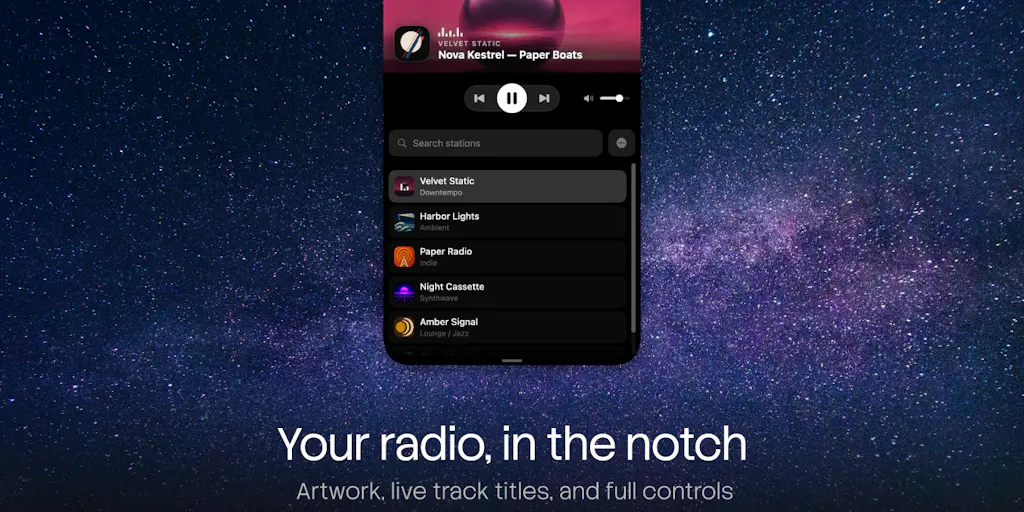
That reframing is the part cross-border operators should study. Most sellers describe their product in terms of features — “we sell ergonomic standing desks” or “we sell silicone kitchen tools.” The better framing is always the friction you remove. Notch Radio doesn’t sell radio. It sells the elimination of a window-management chore. The pill sits collapsed against the notch, expands on hover into a peek card, then a full player with artwork, live track titles and controls, and folds back when you move the pointer away. A commenter on the launch thread, Lesya Pishchevskaya, nailed it: “the hover to open, move away to fold back thing is neat. no window to lose in Mission Control when the track changes.”
If you’re writing Amazon bullet points or Shopify PDP copy this week, ask yourself whether you’re describing your product or describing the moment your customer stops being annoyed. The second one converts.
Why Amazon sellers should care more than Shopify ones
There’s a structural reason this launch matters more to marketplace operators than to DTC storefront owners. Amazon sellers live inside a UI they don’t control. You don’t get to redesign Amazon Seller Central or the buyer-facing detail page. The friction is imposed on you, and your only lever is the copy, imagery, and A+ content you slot into someone else’s template. Notch Radio is a reminder that the winning move in a constrained environment is fitting the existing surface rather than fighting it. It doesn’t ask users to change how they use macOS; it occupies the notch that was already there, empty.
Shopify merchants, by contrast, own their storefront and tend to over-engineer it — pop-ups, spin-to-win, upsell carousels — while the real friction (slow checkout, unclear shipping thresholds, confusing variant pickers) sits untouched. The Notch Radio lesson for Shopify is restraint: one hover, one card, one action. Not five overlays fighting for the same thumb.
How it differs from the incumbents — and where the comparison gets uncomfortable
If you’ve used a Mac radio or streaming app in the last decade, you know the field. Spotify and Apple Music are subscription-first, account-first, and window-first. Free radio apps in the Mac App Store are typically ad-supported, telemetry-heavy, or both. The maker’s differentiation list is short and pointed: the player is not a window; track titles are read live from the broadcast itself with album art matched per song; there is no account and no server, with no analytics, ads, or tracking, and “nothing about what you listen to is ever sent to us”; and you pay once, with nothing renewing.
That last point is the one that should make you sit up. Subscription fatigue is now a measurable drag on conversion in consumer categories, and it’s bleeding into B2B tooling. Cross-border sellers are drowning in monthly SaaS: Helium 10, Jungle Scout, Klaviyo, Loop Returns, ShipBob, a Shopify plan, a TikTok Shop commission structure, payment processing on Stripe or PayPal, and on and on. Every one of those is a recurring line item that eats margin. When a solo developer ships a one-time-purchase product in 2024 and the top comment is essentially “thank god, no subscription,” that’s a signal about where buyer sentiment sits.
Where the math breaks
Here’s the honest read on the pricing, and where I think it gets shaky. The structure is: free forever for up to 5 saved stations; $9.99 once for everything else, which is the launch price until 19 October, after which it becomes $19.99; and a 14-day free trial of the paid half inside the app. The maker also flags that “a trial started this week ends after the launch price does” — a subtle nudge to convert before the price doubles.
For a solo dev with no server costs (the app is local, no account, no backend), a one-time price is rational. There’s no marginal cost per user, so there’s no reason to charge monthly. But the same logic does not transfer to most cross-border tooling. If your product involves inventory sync, carrier rate lookups, or AI inference calls, you have real per-user marginal cost, and a one-time price will eventually kill you. The Notch Radio model is a fit-for-purpose decision, not a universal doctrine. Copy the sentiment — “nothing renews” — but only where your unit economics actually allow it.
There’s also a quiet tension in the free tier. Five saved stations sounds generous until you realize that once you’ve saved five, “those five are what you play” — you can’t browse the rest of the directory anymore. That’s not a free tier; it’s a demo with a soft cap. It works because the friction arrives exactly when the user has formed a habit. For your own freemium or sampling offers, that’s the mechanic to study: let them build a habit, then gate the thing they’ve already started to depend on.
What cross-border sellers can borrow from this launch
Four things, in rough order of how fast you can implement them.
One: launch-day scarcity with a hard date. The $9.99 price is explicitly framed as “the launch price until 19 October; after that it is $19.99.” No vague “limited time.” A date. If you’re running a Q4 promo on your Amazon listings or a Shopify BFCM offer, put a real calendar date on it and repeat it everywhere — PDP, email, TikTok caption, Amazon coupon. “While supplies last” is noise. “Ends 19 October” is a decision.
Two: give codes to a community, not to influencers. The maker dropped ten single-use redemption codes directly into the launch thread, with instructions to redeem via the App Store’s “Redeem Gift Card or Code” flow. That’s a manual, unglamorous tactic that generates engagement because it rewards the people already reading. For cross-border sellers, the equivalent is seeding a Discord, a Facebook group, or a WhatsApp broadcast list of repeat buyers with a small batch of single-use discount codes. Not a public 20%-off banner. A finite set of codes that creates a small in-group.
Three: answer every comment personally. The maker’s thread behavior — replying to individual users by name, asking about external displays and notchless Macs — is the same muscle a good Amazon brand owner uses in Q&A and review responses. It’s free, it compounds, and almost nobody does it consistently.
Four: price the upgrade, not the product. The free tier and the paid tier aren’t “basic vs pro.” They’re “the habit” vs “the habit without limits.” That’s a cleaner mental model than feature matrices, and it’s the one I’d push any DTC operator toward when designing bundles or subscription tiers.
The privacy angle is a positioning weapon you’re probably ignoring
“No account, no server. No analytics, no ads, no tracking; nothing about what you listen to is ever sent to us.” Read that again and think about how many cross-border sellers could say something similar about their data handling — and how few do. If you’re selling to EU or UK customers, GDPR-adjacent messaging isn’t just compliance, it’s differentiation. If you’re selling to US customers post-2023, “we don’t sell your data” is a headline, not a footnote. The catch: you have to actually mean it, which means auditing your Klaviyo flows, your Meta Pixel, and every third-party script on your PDP. Most stores can’t pass that audit. The ones that can should be shouting about it.
Where my judgment says it falls short
I like the product. I’m less convinced by a few things, and cross-border operators should hear the skepticism because the same traps show up in your own launches.
First, the addressable market is genuinely tiny. macOS 14 or later, and the core hook — the notch — only exists on a subset of MacBooks. The maker acknowledges this by drawing a fake notch sized to the menu bar on machines without one, but that’s a workaround, not a feature. If you’re a seller, the equivalent mistake is building your entire brand identity around a platform-specific quirk that half your buyers don’t have. Selling a “MagSafe-compatible” accessory to a market where 40% of phones are Android is the same error in a different costume.
Second, the one-time price creates a support obligation with no recurring revenue to fund it. Every macOS update is a potential break, and every break is a support ticket the developer eats. This is exactly why most indie Mac apps eventually go subscription. I’d bet on a paid major-version upgrade model (v2 costs again) long before I’d bet on true lifetime pricing surviving three OS cycles. Watch for that pattern in your own tooling vendors too — the “lifetime deal” that quietly dies is a classic.
Third, the launch-thread comment volume is thin. A handful of replies, a modest upvote count. That’s not a knock on the product; it’s a reminder that Product Hunt reach is not what it was, and if you’re planning a PH launch as your primary acquisition channel for a cross-border brand, you’re optimizing for the wrong audience. PH is a developer and early-adopter crowd. Your buyers are on TikTok, Amazon search, and increasingly in Temu and SHEIN comparison flows. Use PH for credibility and backlinks, not for volume.
What I’d watch / test next
Three concrete moves for this week, no theory.
Audit your subscription stack against revenue. Pull every recurring tool charge from the last 90 days — Helium 10, Klaviyo, your 3PL, your review software, your Shopify apps — and sort by cost-per-dollar-of-gross-margin. Anything in the bottom quartile that you haven’t logged into in 30 days is a cancellation candidate. The Notch Radio launch is a reminder that buyers are tired of renewals; so are you.
Rewrite one PDP headline around friction removed, not features delivered. Take your best-selling SKU and rewrite the hero line as “the moment you stop [specific annoyance]” rather than “premium [category] with [feature].” A/B it against the current version for two weeks. If it doesn’t move, you learned something cheap.
Put a hard date on your next promo and seed codes to your repeat-buyer list first. Pick a date 10–14 days out. Write it into every asset. Then, 48 hours before the public launch, send single-use codes to your top 50 repeat customers. Measure redemption rate against your last open promo. That’s the Notch Radio playbook, run on your catalog instead of a Mac utility.
The product itself probably won’t change how you run your business. The pricing posture, the privacy stance, and the launch mechanics just might — if you actually copy them.