Why a Browser Cat Actually Matters for Your DTC Brand
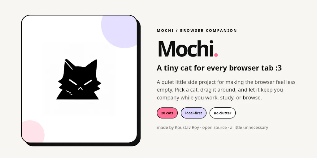
Let’s be honest: when I first skimmed the Product Hunt launch for Mochi, I almost scrolled past. A browser extension that puts animated cats on your tabs? That’s a consumer toy, not an e-commerce tool. But then I sat with it. The more I looked at what KOUSTAV ROY built — a local-first, no-account, drag-anywhere companion that persists across tabs — the more I realized this is a masterclass in micro-engagement, frictionless UX, and retention loops that most cross-border sellers are getting wrong. We obsess over Shopify themes, Amazon listing images, and TikTok ad hooks, yet we ignore the most intimate digital real estate our customers occupy: the browser chrome itself. Mochi isn’t a tool for your stack; it’s a mirror showing you how to think about product attachment in an era of zero attention. For DTC operators drowning in churn, there’s a lesson buried under the catnip.
The Real Problem Mochi Solves: Digital Loneliness and the Tab Fatigue Tax
We sell products across borders, but we compete for attention in a browser that has 50 tabs open. Your customer is juggling Amazon, Gmail, a spreadsheet, and a TikTok tab. There is no emotional anchor. Mochi doesn’t solve inventory management or conversion rate optimization. It solves a quieter problem: the emptiness of the digital workspace. The maker’s own framing — “browser tabs can feel a little too empty after a long day” — is a genuine insight into the psychology of the modern knowledge worker. This isn’t a utility; it’s ambient companionship.
For cross-border sellers, this is a signal. We spend thousands on Klaviyo flows to win back customers, but we rarely ask what makes them feel something during the mundane act of browsing. Mochi’s value proposition is that it “stays in the same spot across tabs, can be dragged anywhere, and works locally without accounts, analytics, or extra noise.” That last part — “without accounts” — is the radical bit. We are conditioned to think that every engagement must be captured, logged, and retargeted. Mochi proves that sometimes, the deepest loyalty is built by asking for nothing in return.
This is a direct challenge to the SaaS bloat we see in tools like Helium 10 or Jungle Scout, where every click is a data point. Mochi strips the interface down to a single, persistent presence. It’s not a dashboard; it’s a pet. The problem it solves is not a workflow inefficiency but an emotional deficit. And that is a category of problem most cross-border operators haven’t even scoped out.
How Mochi Differs from the Incumbents (and Why That’s a Lesson)
When you look at the “productivity” or “companion” space, you usually see two categories. First, there are the heavyweights like Intercom, which is actually promoted on this very Product Hunt page with a deal for startups. Intercom is a customer engagement suite — it’s powerful, but it’s demanding. It wants to be the center of your communication universe. Second, there are the minimalist extensions like Momentum or Momentum-style dashboards that replace your new tab page with a to-do list and a pretty background. Those are static. They don’t move with you.
Mochi’s difference is the persistence of a draggable object. It’s not a page you visit; it’s a companion that follows you. The maker explicitly notes it “should also work on Chromium based browsers like Edge, Brave, Vivaldi, and Opera, not just Chrome.” That’s a subtle but critical distinction. Most indie devs ship Chrome-only and call it a day. By acknowledging the multi-browser reality, ROY is treating the browser as a fragmented ecosystem — which is exactly the reality we face in e-commerce. We can’t just optimize for Amazon; we have to think about Shopify, Walmart, and TikTok Shop simultaneously.
The comparison to Temu or SHEIN is also apt, but in reverse. Those platforms use gamification and endless scroll to keep you inside the app. Mochi uses a cat to keep you company while you do other things. It’s non-intrusive engagement. For sellers, the takeaway is stark: we don’t need to build bigger funnels; we need to build smaller, more meaningful touchpoints. Mochi is the anti-Temu. It doesn’t want your session time; it wants your affection.
Why Amazon Sellers Should Care More Than Shopify Ones
If you’re a Shopify DTC operator, you’re already obsessed with brand personality. You have a mascot, a tone of voice, a unboxing experience. Mochi is a natural extension of that thinking. But for Amazon FBA sellers, this is a harder pill to swallow. Amazon is a utilitarian marketplace. You don’t browse Amazon for fun; you go there to buy. The idea of a “companion” feels alien.
Here’s the twist: Amazon sellers need this lesson more. Because you have no brand equity on the listing page, you rely on repeat purchases driven by habit. Mochi teaches you that attachment is built through presence, not through features. On Amazon, you can’t have a cat follow you around, but you can create a package insert that feels like a companion. You can build a brand store that doesn’t just list products but offers a consistent, quirky visual language. If Mochi can make a browser feel less empty, your product packaging can make a kitchen counter feel less empty. That’s the translation.
What Cross-Border Sellers Can Borrow: The Local-First, No-Lock-In Ethos
Let’s get practical. Mochi “works locally without accounts, analytics, or extra noise.” For a seller, this flies in the face of every Shopify app you’ve installed that begs for your email and phone number just to see a demo. The cross-border market is riddled with tools that promise the world and then hold your data hostage. Mochi’s architecture is a reminder that trust is a feature.
Here’s what you can steal for your own operations:
- Reduce Friction in Your Post-Purchase Flow. If a browser cat can be dragged anywhere without a tutorial, why does your returns portal require a 10-field form? Look at your Shopify checkout. Are you asking for too much? Mochi’s “no accounts” philosophy suggests you should allow guest checkouts and instant returns without forcing account creation. The less you demand, the more they stay.
- Build for the “Ambient” Experience. Mochi is always there, but it’s not screaming for attention. Your email marketing should be the same. Instead of blasting daily deals, consider a weekly “companion” email that adds value without asking for a sale. Be the cat that sits on the tab, not the pop-up that blocks the screen.
- Obsess Over the Micro-Interaction. The fact that Mochi has “20 different personalities” is a huge signal. It’s not one static asset; it’s a suite of moods. For your product, this means variation. If you sell on Etsy, can you offer 20 variations of a customizable engraving? If you’re on eBay, can you offer 20 bundles? The personality is the differentiator.
Where the Math Breaks: The Cost of Cute
Now, let’s be the cynical operator. Mochi is a free extension. The maker is doing this for love, not money. But in the cross-border world, we have to look at the ROI. Can you monetize a cat? Probably not directly. But you can monetize the loyalty it creates.
The math breaks when you try to scale “cute.” You can’t A/B test a cat. You can’t put a pixel on it. It defies the analytics-driven approach that tools like Triple Whale or Northbeam are built on. This is the fundamental tension: Mochi’s success is measured in smiles, not in LTV. For a seller, that’s terrifying because we can’t report it to investors.
But here’s my judgment call: if you can’t measure it, you’re probably doing it wrong. The things that matter most — brand recall, word-of-mouth, the feeling of opening a package — are notoriously hard to measure. Mochi is a reminder that not every initiative needs a ROAS target. Sometimes, you build a cat just to build a cat. And that goodwill translates into a buffer against the race-to-the-bottom pricing wars on Temu and Amazon. When your product is a commodity, your brand’s personality is the only moat.
Where Mochi Falls Short (And What You Should Watch)
Let’s be critical. Mochi is a Chrome extension. That’s a fragile distribution channel. Browser updates can break it. Manifest V3 changes can kill it. The maker is responsive — he updated the video and added a step-by-step guide to the GitHub repository — but this is a solo project. If the developer gets busy, the cat dies. For an e-commerce operator, this is a cautionary tale about relying on single-point-of-failure tools. Your business cannot depend on a browser extension that might be abandoned.
Moreover, the installation process is still too technical for the mass market. One commenter, Dorina-Maria Anton, explicitly asked for an “easy to install extension for non-techy people.” The maker responded by adding a guide, but the friction remains. This is the classic indie dev trap: you build for yourself, not for the user. We see this in e-commerce too — sellers build Shopify stores that make sense to them but confuse the average buyer. The lesson here is to test your funnel with a non-techy person. If they can’t install your “product,” they won’t buy your product.
The Distribution Bottleneck
Mochi’s biggest weakness is that it lives in the Chrome Web Store, which is a graveyard of forgotten extensions. There’s no TikTok Shop integration, no Amazon affiliate loop. It’s a standalone piece of joy. For a seller, this is a lesson in distribution. You can have the best product in the world, but if it’s not on the shelf where the traffic is, it doesn’t exist. Mochi’s shelf is the Web Store. Your shelf is the Amazon buy box. Don’t build a cat if you don’t have a way to put it in front of millions of tabs.
What I’d Watch / Test Next
This week, I’m not going to download Mochi for my own browsing. I’m going to study it. Here are three concrete tests for your cross-border operation:
- The “No Account” Audit. Look at your guest checkout flow. If you’re forcing account creation for a one-time purchase, kill it. Test a “local-first” checkout that doesn’t store data. See if your conversion rate on Shopify increases by 10%. Mochi’s success hinges on zero friction; your checkout should too.
- The “20 Personalities” Product Test. If you sell on Etsy or eBay, take your bestseller and create 20 variations of the presentation, not the product. Different colors, different bundle names, different “moods.” See which personality catches fire. Mochi proves that variety in personality drives attachment.
- The “Ambient” Email Flow. Instead of a sales blast, write a one-line email that just says “We’re here.” No link. No CTA. Just a presence, like a cat on a tab. See if your reply rate or engagement metrics shift. It’s counter-intuitive, but the absence of a demand might make your brand more memorable.
Mochi is not a tool for your stack. It’s a philosophy. It’s a reminder that in a world of infinite tabs, infinite products, and infinite ads, the brands that win are the ones that offer a moment of quiet, persistent companionship. Stop trying to be the loudest ad. Start trying to be the friendliest tab.