The Particle-UI Temptation Every DTC Brand Should Resist (And What to Steal Instead)
Cross-border sellers spend real money on conversion rate optimization, yet most of that budget flows into the same three buckets: better product photos, faster checkout, and another abandoned-cart flow. Almost nobody spends it on the micro-moments — the loading spinner, the “added to cart” confirmation, the payment-processing state — even though those are exactly where mobile shoppers bail. So when a maker ships a library of morphing particle interfaces, my instinct isn’t “cute toy.” It’s “where does this fit into a Shopify PDP, and where does it quietly cost me revenue?” That tension is the whole story here.
What Dots UI Actually Is, Stripped of the Hype
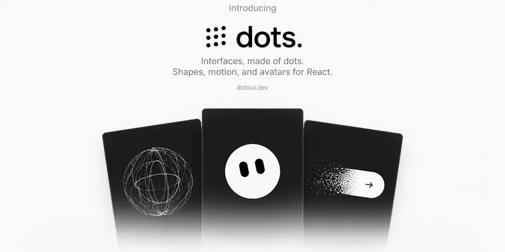
Dots UI is a React component library from maker Hamza Al Sorkhy, built under the Melo banner. The pitch is narrow and honest: he wanted to build morphing interfaces made out of particles in React, and what started as a visual experiment turned into a library of 171 shapes that morph between each other and can be used as real interface elements.
The shipped feature set, per the maker’s own launch copy:
- Over 170 shapes across AI, productivity, media, commerce, navigation, and more
- Morphing — transition smoothly from one shape into another using the same particle system
- React components — drop them into your app and control them like normal UI
- Studio — create your own shapes and export them for your project
- Customization — adjust particles, motion, size, and behavior
Pricing is a free tier to “explore and use,” with a pro version containing “even more shapes and configurations.” The exact pro price is not disclosed on the launch page. That matters for operators doing tooling-stack math — more on that below.
Two things in the comments are more useful than the marketing copy. Asked whether morphs can be triggered from application state rather than a timer, the maker confirmed: “Yes! U can trigger on your own custom code as you please!” That single answer is what separates a decorative widget from something an operator can wire into a real funnel event.
Where this sits against the incumbents
If you’re a store owner, you’ve already solved “animated UI” in one of four ways, and it’s worth being precise about which one Dots UI displaces:
- Lottie / LottieFiles — the default for micro-animations on Shopify and headless storefronts. Designers ship JSON exports, devs drop in a player. Mature, accessible-ish, huge library.
- Rive — state-machine-driven animation that’s genuinely interactive, popular with product teams who want one asset to respond to multiple states.
- CSS/GSAP hand-rolls — what most agencies actually bill you for.
- Framer / Webflow interactions — no-code motion for marketing pages.
Dots UI doesn’t beat any of these on breadth. What it offers is a specific aesthetic — particle-based, morphing, generative — pre-built as React components. That’s a narrower claim, and it’s the honest one.
Why a Cross-Border Seller Should Care At All
Here’s my actual thesis: the value of Dots UI to an e-commerce operator is not the shapes. It’s the pattern it demonstrates — state-driven feedback that feels continuous instead of swapped.
Think about the ugliest moment in any cross-border checkout. A shopper in Germany taps “Pay.” The button either:
- Goes grey and does nothing visible for 1.8 seconds (perceived as broken), or
- Swaps to a spinner that appears from nowhere (perceived as a page glitch), or
- Shows a static “Processing…” that a screen reader may or may not announce.
Now consider the morph the maker’s own commenter Amanda Ornellas Gutierres described: “A loading dot turning into a checkmark with the same particles sounds so much nicer than swapping icons.” That’s the entire operational insight. It’s not about particles. It’s about continuity of state — the user’s eye never loses the object it was tracking. On a mobile PDP where the Add-to-Cart button is the single highest-stakes element on the page, continuity is a conversion lever.
Why Amazon sellers should care more than Shopify ones
This is where I’ll be blunt. If you sell primarily on Amazon, Dots UI is nearly irrelevant to you — you don’t control the buy box, the A+ content rendering, or the checkout flow. Your motion budget is spent on video and infographics inside Amazon Seller Central listing assets, and Amazon will not let you ship a particle-morphing CTA.
But if you run a Shopify DTC storefront — or a headless build on Next.js — this is exactly the kind of library that turns a generic template into something that feels authored. And “feels authored” is the entire moat against the Temu and SHEIN price race. Those marketplaces will always beat you on unit economics. They cannot beat you on the feeling of a checkout that respects the shopper’s attention.
For TikTok Shop operators, the calculus is different again: most of your conversion happens in-app, but your landing pages and post-purchase tracking pages are yours. That’s where a morphing confirmation state could actually earn its keep.
What I’d Actually Borrow From This Launch
Strip away the aesthetic and there are four transferable practices here, ranked by how fast I’d implement them.
1. Trigger feedback from state, not from timers
The maker’s confirmation that morphs can be triggered on custom code is the load-bearing detail. Any animation that runs on a timer is decoration. Any animation that fires on cart.added, payment.succeeded, or inventory.low is instrumentation. Audit your storefront this week and count how many animations are timer-driven. Those are the ones to convert.
2. Invest in the “in-between” states
Most CRO tooling — Klaviyo flows, Triple Whale dashboards, whatever Helium 10 tells you about listing health — obsesses over entry and exit. Almost nothing optimizes the transition. Loading, processing, syncing, confirming. That’s where trust is won or lost, and it’s where a particle morph is genuinely better than a static icon.
3. Treat the animation library as a design system, not a one-off
The Studio feature — create your own shapes and export them — is the part I’d push your design lead to take seriously. If you’re going to use motion at all, you need a system of states, not a folder of Lotties. Otherwise your checkout morphs one way and your returns flow morphs another, and the brand feels stitched together.
4. Budget for the accessibility tax
See the next section. It’s not optional.
Where My Judgment Says This Falls Short
I want to be fair to the maker and honest with you, because both matter.
The accessibility pushback is correct, and the maker didn’t answer it
Commenter Gal Dayan, who ships Dial, raised the sharpest objection on the thread: “the moment a loading state or a button is made of particles instead of a plain shape, you’ve got a prefers-reduced-motion user and a screen reader both getting nothing useful — what’s actually announced or shown as the static fallback when motion is off or when the particles haven’t rendered yet on a slow connection.”
That question went unanswered in the visible thread. For a cross-border operator, this is not a philosophical concern — it’s a legal and revenue one. If you’re selling into the EU, you’re already navigating the European Accessibility Act, and if you’re selling into the US, ADA-driven demand letters are a real line item. A particle-based button with no static fallback is a liability, not a delight.
Performance on mid-range Android is unproven
Furkan Savrun asked the question every operator should be asking: “What’s rendering under the hood — canvas, WebGL or SVG — and how does it hold up on mid-range phones? Any plans for a React Native version, or a way to export shapes for use outside React?” Also unanswered in the thread.
This matters enormously for cross-border. Your highest-growth markets — Southeast Asia, Latin America, parts of Southern and Eastern Europe — are dominated by mid-range Android devices on inconsistent networks. A WebGL particle system that runs beautifully on a MacBook in a demo video can tank LCP on a $150 Xiaomi. Until someone publishes real Core Web Vitals numbers on mid-tier hardware, I would not put this anywhere near a checkout flow.
The pricing opacity is a real friction for operators
“Free to explore and use with a pro version containing even more shapes and configurations” is fine for a hobbyist. It’s not enough for a brand owner deciding whether to standardize a design system on top of it. Not disclosed on the page: pro price, licensing terms for commercial storefronts, seat limits, or whether the Studio exports are yours to keep if you churn. Any of those can kill a procurement conversation.
React-only is a hard constraint
If your storefront is on Shopify Liquid, WooCommerce, BigCommerce, or Etsy, you’re out of scope unless you’re running a headless front end. That’s not a flaw in the product — it’s an honest boundary — but it excludes the majority of the audience reading this.
Where the math breaks
Let’s do the operator arithmetic. Say you’re a $5M GMV Shopify brand with a 2.4% conversion rate. A genuinely better Add-to-Cart feedback state might move you 5–15 basis points. On $5M, 10 bps is $5,000 in incremental revenue — real, but not transformative. Now subtract: design time to integrate, dev time to build accessible fallbacks, ongoing maintenance as React versions churn, and the risk of a performance regression on mobile. If you’re a solo operator, the ROI is thin. If you already have a design system and a front-end dev, it’s a cheap win. The math only works at the top of your funnel, not the bottom.
What I’d Watch / Test Next
Here’s what I’d actually do this week, in order.
First, pull up your own checkout on a mid-range Android over throttled 3G and screen-record the Add-to-Cart and Pay transitions. Watch them at 0.25x. If you can’t articulate what changed on screen and why, you have a conversion leak regardless of whether you ever touch Dots UI.
Second, if you’re on a React or Next.js storefront, grab the free tier and prototype one state transition — ideally the payment-processing-to-success morph — behind a feature flag. Measure LCP and INP before and after with web.dev tooling. If mobile INP regresses by more than a few milliseconds, kill it.
Third, before you ship anything to production, write the static fallback first. If prefers-reduced-motion is set, what does the user see? If the screen reader announces nothing, that’s a bug, not a design choice.
Fourth, ping the maker directly with the two unanswered questions — rendering engine and React Native roadmap — and ask for a commercial license sheet. If those come back clean, this becomes a legitimate candidate for your design system. If they don’t, bookmark it and revisit in six months.
The particle aesthetic will date. The underlying lesson — that state continuity beats icon swapping — won’t. Borrow the lesson now, and let the shapes catch up.


